Author: Changsoo Lee
Usability Evaluation of UMN Moodle website
Based on Nielsen’s 10 Usability Heuristics
Have you ever read Nielsen’s blog posting, “10 Usability Heuristics for User Interface Design?” (http://www.nngroup.com/articles/ten-usability-heuristics/). This blog posting summarizes the 10 most general principles for interaction design. I found that these 10 general heuristics are very useful for those who are planning to design or redesign their websites. I will apply Nielsen’s 10 usability heuristics to the UMN Moodle website to evaluate its usability. This will help readers who are already familiar with the Moodle website to understand Nielsen’s 10 usability heuristics and to comprehend how we can evaluate a website in terms of Nielsen’s heuristics.
In each section, Nielsen’s usability heuristic is introduced in italics, followed by my evaluation with visual examples associated with the heuristic of the Moodle website.
1. Visibility of system status
The system should always keep users informed about what is going on, through appropriate feedback within reasonable time.
The Moodle website shows a spinning animation while it is loading a part/function of a website, as shown in Figure 1. This helps users understand the system status, in this case the system is not ready because it is loading. You can see spinning animations at many places on the Moodle website. For example, when you try to upload attachments, you will see Figure 2 and 3, which reveals the system status.
![]()
Figure 1. Spinning animation indicates, “I’m not ready. I’m in process”
.

Figure 2. Users are able to recognize the attachment function is not ready and
they should wait.
.

Figure 3. The attachment function is now ready.
2. Match between system and the real world
The system should speak the users’ language, with words, phrases and concepts familiar to the user, rather than system-oriented terms. Follow real-world conventions, making information appear in a natural and logical order.
The Moodle website has a calendar on the left of the front page. As shown in Figure 4, the calendar is in the same form of the real world calendar. Certain days are enclosed by rectangular boxes, which indicate due dates or events related to courses that students are attending. In real world, many people mark important days by circling days on their calendar. Thus, we can conclude that the uses of calendar on the Moodle website are very similar with the uses of the real world calendar. Users are able to know how to use the Moodle calendar intuitively.


Figure 4. Some days in the calendar are enclosed by rectangular boxes. If you move your cursor over a certain day, you will see the detailed information about the selected day.
3. User control and freedom
Users often choose system functions by mistake and will need a clearly marked “emergency exit” to leave the unwanted state without having to go through an extended dialogue. Support undo and redo.
One of the most important functions of the Moodle website is the forum. Students are encouraged to write their opinions on the forums. However, many students sometimes delete by mistake what they wrote. To prevent from deleting words by mistake, many word processors provide “undo” and “redo” functions. The forum of the Moodle website also provides these functions as shown in Figure 5.

Figure 5. The forum on the UMN Moodle website provides “undo” and “redo” functions, so users are not afraid of deleting words by mistake
4. Consistency and standards
Users should not have to wonder whether different words, situations, or actions mean the same thing. Follow platform conventions.
The Moodle website provides a consistent layout at any location. In particular, the maroon- and gold- colored bar always appears on the top of the screen. The identity of the Moodle website – University of Minnesota, Driven to Discover – is displayed on the left top, under which the name of the course is shown. Right below the bar, “Breadcrumb” indicates where the user currently is. In Figure 6, the location of the user is “My Home > WRIT 5112 – 001F13 > November 12 – 18 > Discussion.” These are the conventions that are consistently provided to users in most websites.

Figure 6. The top of the website always shows the identity of the website, the name of the course, and the breadcrumb.
5. Error prevention
Even better than good error messages is a careful design which prevents a problem from occurring in the first place. Either eliminate error prone conditions or check for them and present users with a confirmation option before they commit to the action.
If you click the back button on your browser while writing a post, you will see a pop-up message that says “Are you sure you want to leave this page?” as shown in Figure 7. It asks you to select either “Stay on Page” or “Leave Page.” This pop-up message prevents you from leaving a webpage that you are working on by a click mistake.
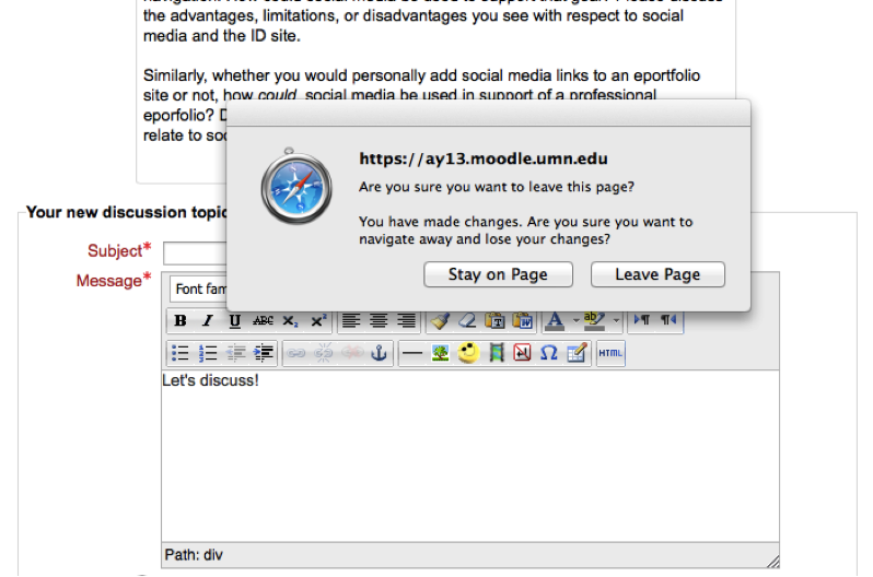
Figure 7. This useful pop-up message prevents you
from leaving the current page unintentionally.
6. Recognition rather than recall
Minimize the user’s memory load by making objects, actions, and options visible. The user should not have to remember information from one part of the dialogue to another. Instructions for use of the system should be visible or easily retrievable whenever appropriate.
The Moodle website shows the number of unread posts next to a forum as shown in Figure 8, so that users can recognize how many posts are left to read. Users do not need to memorize what postings they read before.

Figure 8 “Discussion” has 4 unread posts. You have 4 unread posts!
7. Flexibility and efficiency of use
Accelerators — unseen by the novice user — may often speed up the interaction for the expert user such that the system can cater to both inexperienced and experienced users. Allow users to tailor frequent actions.
The Moodle website does not provide shortcuts for expert users. If the website provides shortcuts like other websites, expert users will be able to navigate the Moodle quickly. Figure 9 shows the shortcuts that are given by G-Mail. Many people use shortcuts in frequently used programs or Internet services.

Figure 9. Shortcut list in G-Mail
8. Aesthetic and minimalist design
Dialogues should not contain information which is irrelevant or rarely needed. Every extra unit of information in a dialogue competes with the relevant units of information and diminishes their relative visibility.
The Moodle website tends to show everything that it has. However, the users might not want to see every piece of information whenever they access the Moodle website. For example, Figure 10 shows the course webpage on the Moodle. The content of Sept. 3 – 9 is not current, but it still appears first. Also, it has lots of text. In order to access the recent content, the users should scroll the webpage all the way down. However, removing the old content is also not a good approach because there would be students who want to see the content of Sept. 3 – 9. Therefore, the Moodle website should provide a function that hides older information selectively. It will help the website maintain aesthetic and minimalist design.

Figure 10. The content of Sept. 3 – 9 is not as useful as the content of Nov. 12 – 18, because today is Nov. 14. In order to read the recent information, you have to scroll the webpage all the way down.
9. Help users recognize, diagnose, and recover from errors
Error messages should be expressed in plain language (no codes), precisely indicate the problem, and constructively suggest a solution.
In case of errors, the Moodle website shows Figure 11, in which the error message is “Can not find data record in database table forum discussions.” Can you understand this? I think that many students do not understand what they did wrong when they get this error message. You can click the yellow text “More information about this error” in Figure 11 to see more information about the error. However, you will stay uninformed after clicking because the additional displayed information is still full of technical jargon as shown in Figure 12.

Figure 11. The error message says something. I am not sure what though.

Figure 12. The explanation is full of technical jargon.
The users may not be able to resolve their issues with this message.
10. Help and documentation
Even though it is better if the system can be used without documentation, it may be necessary to provide help and documentation. Any such information should be easy to search, focused on the user’s task, list concrete steps to be carried out, and not be too large.
The Moodle website provides an excellent help function to users. This is always on the left of the website and the content of the help function is detailed, well organized and abundant. In addition, there is an email address dedicated for help as shown in Figure 13. When users are in trouble, they will be able to find ways to resolve their issues easily with the Moodle help functions.


Figure 13. Helps on the Moodle website
Conclusion
In this blog posting, I applied Jakob Nielson’s 10 heuristics to the UMN Moodle website to evaluate its usability. The UMN Moodle website complies with most usability heuristics; however, some usability issues are identified in “Flexibility and efficiency of use”, “Aesthetic and minimalist design” and “Help users recognize, diagnose, and recover from errors” heuristic sections and they could impede the usability of the Moodle website. Therefore, it is necessary to review and revise the identified issues to improve the usability of the Moodle website.
Nielson’s 10 heuristics are one of the most widely used usability heuristics for web user interface design. (http://en.wikipedia.org/wiki/Heuristic_evaluation) I hope the explanations above help you to understand how to apply heuristics to evaluate usability of websites, and they enable you to find the strengths and the areas for improvement of your websites.
